5 gen 2013

The Community Bookshelf in Kansas City


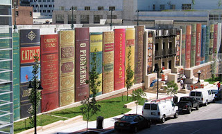
The Library of Kansas City, which was founded in 1873, presents an architectural structure that reflects its function - is unique building of this kind in the world - "The Community Bookshelf" is a striking feature of city's downtown. It runs along the south wall of the Central Library's parking garage on 10th Street between Wyandotte Street and Baltimore Avenue. The book spines, which measure approximately 25 feet by 9 feet, are made of aluminum with applied large format graphics . The shelf showcases 22 titles reflecting a wide variety of reading interests as suggested by Kansas City readers and then selected by The Kansas City Public Library Board of Trustees.

Among the titles selected are "Cien Anos de Soledad" (100 Years of Solitude) by Gabriel Garcia Marquez, "The Republic" by Plato, "A Tale of Two Cities" by Charles Dickens etc.. and Children's Stories like "Winnie the Pooh" by A. A. Milne or "The Wonderful Wizard of Oz" by L. Frank Baum.

The project was realized by Dimensional Innovations. It has won multiple awards; including an SEGD Award and an IDEA award.

The mission of the Kansas City Public Library is to provide resources, tools and adequate space in order to create a dynamic urban community-oriented culture, learning and the expansion of knowledge. It is considered by its users as an invaluable resource.

More info

photo credits: Dimensional Innovation


4 gen 2013

Weeds Blossom: a collection from the margins of paved roads


Weeds Blossom is a design collection inspired by wild city flowers: the small presences that share our living spaces, the so called “weeds".
Collected from the margins of paved roads they have been transported on fabric through a photo-chalcographic process. The details of the flowers, leaves and stems are translated into a fine imprint characterized by unique and unusual details.
Weeds and Blossom is "the negative of the aesthetics of conventional nature": plants that usually considered insignificant (tapinabur, echium volgare or dacus carota etc) become in their elegance, a strong and legendary presence.
Weeds and Blossom is an invitation to open our eyes beyond the conventions that flatten reality.
Weeds Blossom uses 100% natural materials and water based inks, each item is individually hand made.

Weeds Blossom is a project realized by the visual artist Serena Porrati, born in Italy and currently based in London. In her works the protagonists and the recurring theme elements are hidden, silent, overwhelmed by the symbolic orders of civilization. The overall aim of her research is to expand or destroy the idea of nature, highlighting the animal in the human and creating multiple suggestions to re-interpret existence.

More info


3 gen 2013

Small Moons, portraits of Louisville's community


SuttonBeresCuller are a trio of artists - John Sutton, Ben Beres and Zac Culler - who have worked collaboratively since 2000. They create ways to engage viewers beyond the confines of gallery or museum walls through mobile sculpture, street actions and temporary site-specific installations.

The last art work created by the three artists is the Small Moons installation, at the Land of Tomorrow gallery in Louisville, Kentucky. The project is developed in partnership with artwithoutwalls.

Small Moons” is a site specific art installation incorporating found and reclaimed objects attached to large globe-shaped skeleton frames. The artists have been working in Louisville for a month on the exhibit, they asked local residents to donate their unwanted objects to be part of this large installation.

"We sent out requests for people to bring in their trashed treasures or treasured trash, things they no longer wanted that they might otherwise give away or throw away," says Alice Gray Stites, artwithoutwalls director and 21C chief curator.

Small Moons was on view at the Land of Tomorrow gallery from the end of September through the beginning of November in 2012. When the exhibit ends, individual items were returned to people and the globes were donated to 21C’s collection, where they will help create similar exhibits in other cities.

More info:

photo credits: SuttonBeresCuller


2 gen 2013

What Did I Buy Today? A journal about Obsessive Consumption.


Kate Bingaman-Burt’s artful new mini-ledger, invites readers to answer that question every day, promoting frugality. Kate Bingaman-Burt is an illustrator and educator. She has been making work about consumption since 2002. Her first book, ObsessiveConsumption, was published, by Princeton Architectural Press in 2010. The new pubblication What did I buy today. Obsessive consumption introduces new charts, graphs and illustrations of items worth saving for.
“Obsessive Consumption is repulsed and grossly fascinated by the branding of consumer culture,” her site explains. “It wants to eat the entire bag of candy and enjoy the sickness that it feels an hour later. It doesn’t want to be an outside critical observer. It wants to be an active participant.” Her hope, she says, is to engage an audience on a more conceptual level, inviting them to think about consumption and obsession.
Bingaman-Burt has famously hand-drawn her daily purchases for years. The daily drawings were born out from drawing her credit card statements in 2004. Today she is in the seventh year of that. Soon she started collecting those images on a Web site. And this turned out to be the first iteration of something that continues to this day: “I basically built a brand out of Obsessive Consumption,” she says, “and ran with it.” It behooves us all to monitor our spending.
She started drawing something that she had purchased each day on February 5th, 2006, and of course she still drawing, "until the hand cramps!".


Kate Bingaman-Burt is an assistant professor of graphic design at Portland State University. She is a founding partner of the Public Design Center. Her work has been featured in the New York Times; in numerous magazines, including Print, Adorn, Dwell, and How; and in books including Hand Job and Handmade Nation.

More info


1 gen 2013

Tony’s Farm in Shangai, by Playze


Berlin and Shanghai-based studio Playze  has recently finished 'Tony’s Farm' for the biggest organic food farm in Shanghai, which produces vegetables and fruits. It is meant to be more than just a place for vegetable production, its vision is to integrate the consumer and therefore promote a natural lifestyle.

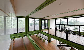
This is built out of 78 recycled freight containers. Containers were chosen for their strength as well as their sustainability, being "a metaphor for recycled space", as the architects explained. The container architecture has become popular, especially because of the iconographic and direct reuse of material. All over the world container structures emerge.

Local bamboo was also used for indoor and outdoor flooring.

To link the activities of the working people with the visitors of the farm, the building complex combines the main reception, a lobby, (working also for the future hotel rooms) and a vip area, with the new offices and an existing warehouse, where the fruits and vegetables are packaged. The building provides transparency within the manufacturing process. The interior is clean and simple, with the exterior providing as an impermeable barrier of the elements to the working environment.  The building design is driven by the concept of sustainability, combined with it's iconic qualities, it communicates and promotes the core concept of the company.

More info
www.playze.com
www.tonysfarm.com

photo credits: bartosz kolonko


31 dic 2012

Krisis: An Archive for disorientation

Archive for disorientation
Krisis Magazine is a project which underlying’s aim is to suggest a reflection about different aspects of the permanent crisis and about the responsabilities which come from operating as designer, that is to say as the ones who shape things, both material and immaterial, within this contemporary scenario. 

The theme of the last issue is Orientation. From time immemorial, mankind has tried to constitute their own orientation within the world in which we dwell by using different tools for discerning information: linear language (in the shape of narrations and myths), by systems of classification (mainly of taxonomical type), by graphic representations (atlases, guides and maps), etc. During the last decades these models entered a crisis. The crisis of orientation was born from the complexity of correlations between numerous different emergencies, which most visible effect is a total tendency to fragmentation, to individualisation, to selection, to separation, to the monetarisation of the social and environmental context. In this scenario it becomes crucial to think over disorientation as an experience that may be a source of renewal for new practices of orientation. 

From this point grow up the new project Archive for disorientation, an online visual archive about disorientational paradigm. 

Krisis is a project by the collective Unità di Crisi, which consists of communication designers, professors and theorists.


30 dic 2012

Sustainable Diary


Date of Birth: December 2012, Milan

Sustainable Diary is a blog about day by day sustainable good ideas.
Here you can find news on architecture, design, art, fashion...
Follow us!

Twitter Delicious Facebook Digg Stumbleupon Favorites More